My Paint Colors
I have had quite a few questions on the paint colors in my home, and although I try to answer all questions in the comments, I realize if you are popping in for the first time you don’t always see them. So today I’m going to give you a bit of a home tour, sharing my paint colors throughout. I first want to tell you that I have quite a few different brands, although I usually get them all mixed in the Behr ultra with a satin finish. I like how it paints, and it’s not as expensive as some other brands.
The first room you walk into is the eating area/kitchen…
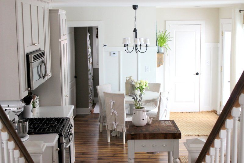
The wall color is called “Gull” by Martha Stewart.

and the cabinets
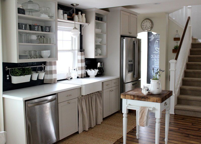
are another Martha Stewart color called “Sharkey Gray.”
I love this gray because it really takes on a warm tone.
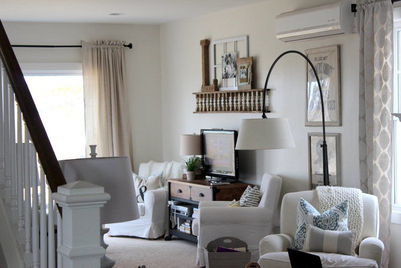
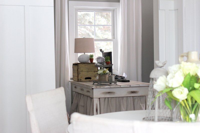
My living room and dining room are next….
and..
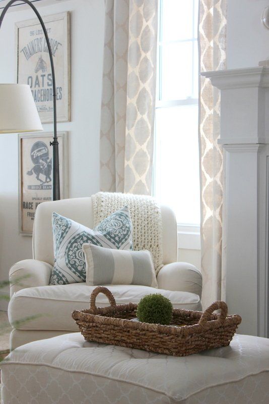
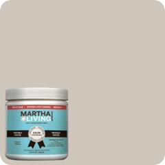
Are another Martha Stewart color called “Glass of Milk.”
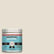
It’s a nice creamy white that I like. It’s not too cold, not too warm. Just right:)
My office is painted in Martha Stewart “Bedford Gray.”
Bedford Gray..
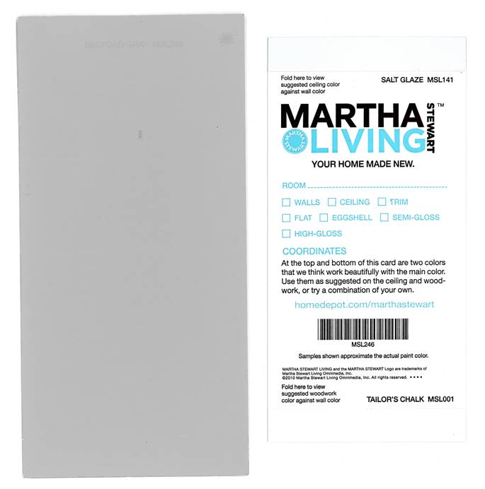
Although I like this color, I may repaint this room at some time. This color is really pretty in a bright airy room, but the office only gets morning sun and then is quite dark the rest of the day. The gray looks a little too ” cool” for my liking.
The last room on the main level is the bathroom. This room I needed to paint in a jiffy and ended up running to walmart to pick out a color since it was the closest.
It was a better Home and Gardens color called “Newsworthy Neutral.” I have actually had a lot of people ask for this color. It is a great neutral to blend grays and browns.
I couldn’t find a color of it online so hopefully they still have it.
That does it for the downstairs.
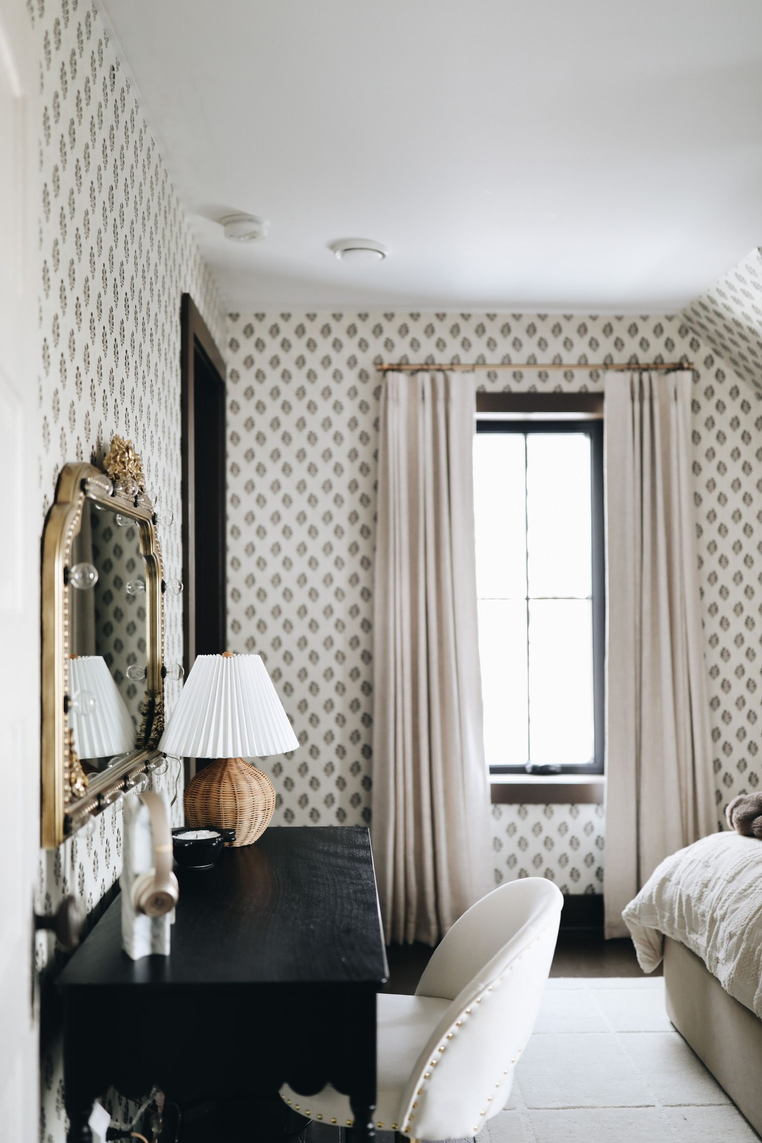
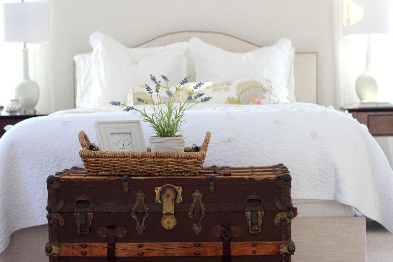
We move upstairs and in my bedroom I used another Martha color called “Whetstone Gray.”
and..
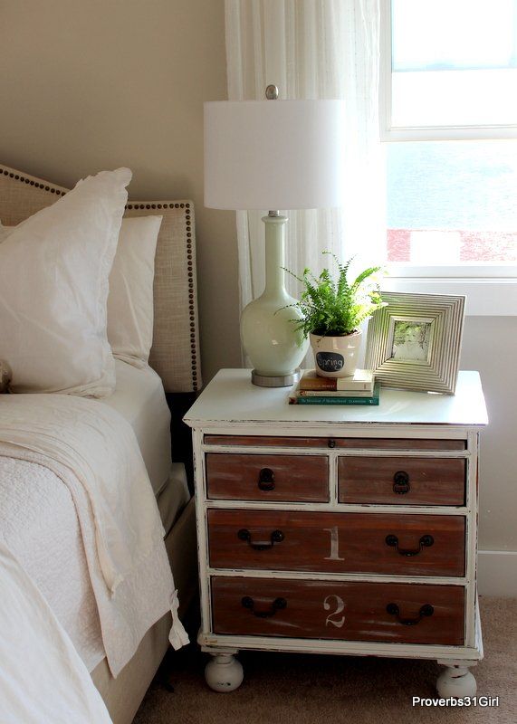
I love how subtle it is. Surprise!

These colors all look quite similar online, and truthfully they are all very soft subtle colors, so there isn’t a huge difference, but a bit more than you can tell from the photos.
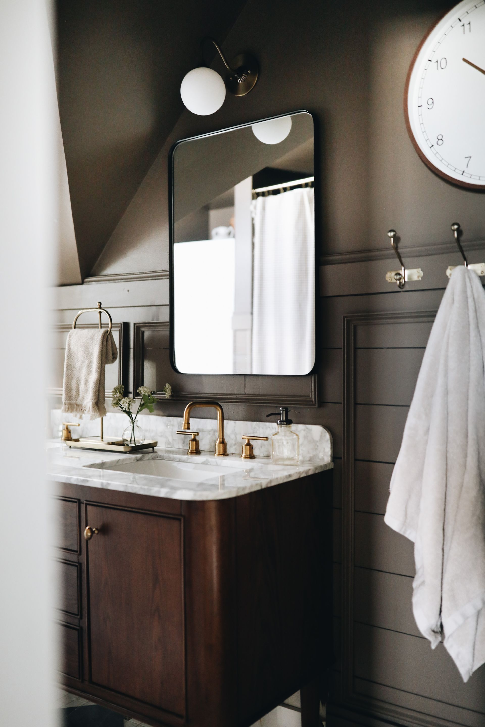
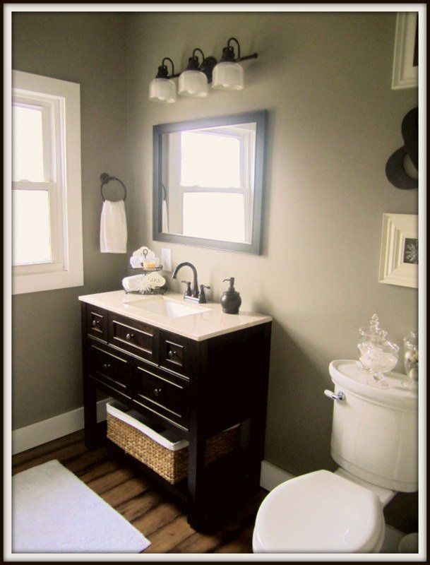
My bathroom is also in the “Gull” color that’s in our kitchen/eating area.
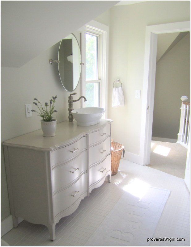
And Sharkey Gray is on the vanity.
Kynlees room is such a soft soft pink color, that my mom swore it was white:) I love it though..
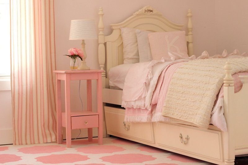
It’s called Billowy Clouds and it was a Behr color.
The last room is Tates, and I just used the stock white from the shelf..

All of our trim is painted in Bejamin Moore, Decorator’s white..
It’s a little bit warmer than a stark white, but still gives good contrast.
So there you have it, finally a post with all the paint colors in one spot.
Happy Painting!